
Cutting Tolerance: What to Watch for When Setting up Your Book Cover
What should you watch for when setting up your cover? There a lot of factors that go into cutting books apart before being bound, such as misregistered sheets, jogging the paper, clamp pressure, and even the sharpness of the blade matters. If those printing terms are foreign to you, then don’t worry, we lay things out below. With that said, we strive to be 100% accurate with our work, but there are times the cutting tolerance can be noticeable. It is standard in the printing business and nothing you need to be overly concerned with, but you should plan for such possibilities when working on the layout.
Cutting Tolerance
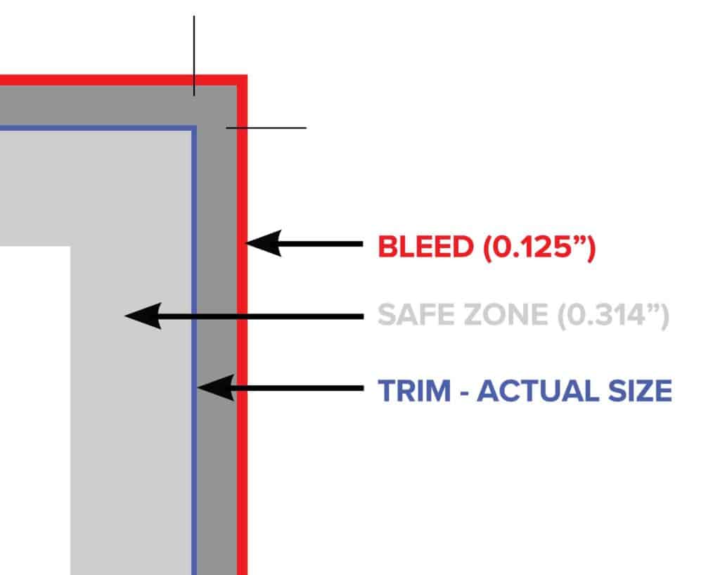
Here at Presto Page, we strive to produce 100% perfect products. However, as with any mechanical process, some tolerances should be taken into account. Our trimming tolerance is 1/16″ in either direction. For example, the cutting tolerance is the slight variations that occur when printing projects are cut down to size. Also, anything that comes within 1/16″ of the edge of the cut line could potentially be cut off. For example, text or other elements that you want to ensure are not trimmed away must be placed more than .314″ away from the expected edge of the design – for binding purposes. Please see the bleeds and borders help page for more information on bleeds, borders, and margins.
Setting Up Your Cover: Cutting Tolerance and Document Setup
The diagrams below are for helpful document setup and to learn more about cutting tolerance. Here, the 1/16th” cutting tolerance is the worst-case scenario, not an expectation. There will always be a bit of a draw on a cutter and we want you to be informed of this possibility.
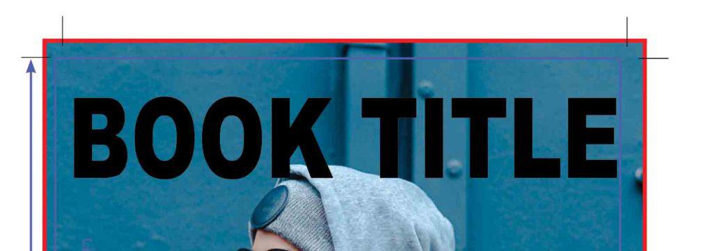
Please note, if your project has art going to the edge, a 1/8″ bleed is needed. Also, essential elements should not be in the “Safe Zone” (.314″) from the edge of the page to allow for the cutting and the bookbinding tolerances.
In this example, the trim marks indicate the intended document bounds. In comparison, the solid blue line represents the cutting tolerance and how the cutting can vary up to 1/16″.
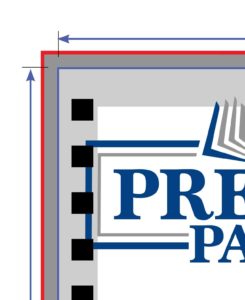
To the right, the dotted boxes represent the punching needed for the twin loop. As you can see, the logo is bleeding into the “Safe Zone” and will be punched through. Consequently, Presto Page uses a Safe Zone of .314″ on all of our covers because it allows for all the possible binding options. As a rule, you must account for the binding style when you design the layout of your covers. If not, the end result will look off-centered.
The Basics of Printing
Image Resolution: Learn about the best image resolution for your next project.
Bleeds & Borders: Setup your next print file with the amount bleed and borders needed.
Cutting Tolerance: How to account for cutting on your print file.
Color: Read more about the Presto Page color process.
If you’d like to see how to format the text and covers or you can download our text templates or cover templates.