
The Book Cover’s Design is Critical to a Book’s Success.
Book cover design is critical to a book’s success, and there is a lot more to consider than you might expect. Keep in mind these five things when working on your next cover, and watch it drive sales.
Also, as a self-publisher, you can always change the cover of your book. So, if you have a cover you think might be hurting your sales? Swap it out for a new one and compare your numbers.
When you ask an artist or graphic designer to commission a book cover, ask them to follow these guidelines. Unless, of course, your genre demands other considerations.
- An image of the protagonist or the antagonist is the central point of interest.
- All factors considered the body mass of this image is placed in one of the four corners, as defined by the Rule of Thirds.
- All other elements in the scene need to project leading lines toward the central vision.
- The other features in the cover mimic the mise en scene of the narrative.
- Often, I use custom-designed fonts for cover text, but it is not necessary. You want a font that is native to the background of the story.
For more info on formating your book cover, click HERE and go to the book cover dropdown.
If you’d like to see a great breakdown of popular covers, what works verse what doesn’t, then please check out a post by King Jaz by clicking here.
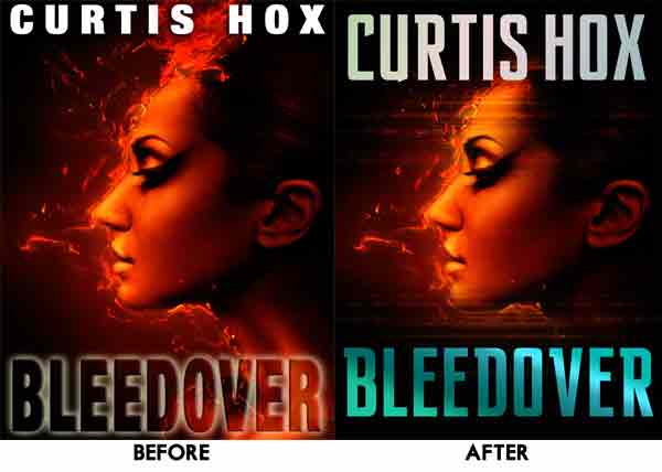
Improvements:
- The author’s title isn’t getting lost at the top of the book and isn’t in danger of trimming off.
- The title is no longer disappearing into the background and is popping with an eyecatching, contrasting color.
- The image of the face is framed with the type and is more visually appealing because it follows the Rule of Thirds(see the second example below).


Book Covers LOVE the Rule of Thirds
The Rule of Thirds’ premise is that when key elements or objects (such as horizon lines) cross the page at a division of thirds, rather than in half, the image is more appealing. Have you ever noticed that photographs look better when the horizon line crosses the page at the upper or lower third rather than straight through the middle?
Using the Rule of Thirds as the basis of your layouts, you can design visually appealing book covers with little time or effort.
Start with a blank page and divide it into thirds horizontally, then again vertically to create a nine-box grid. The lines and intersections will serve as guides for placing key text and graphics. The fourth illustration below gives you an idea of how the page can be divided and laid out using some, but not all, of the grid lines and spaces.