File Prepping: The Basics of Printing
What is an International Standard Book Number (ISBN)?
You may have asked yourself, “Do I need an ISBN?” and the answer depends on what you want to do with your book. But if you’re going to sell your book, then the answer is yes! International Standard Book Numbers, also known as ISBNs or ISBN Numbers, are required to publish and distribute a book through booksellers. ISBNs are used to identify books across the world, and nearly all booksellers need books to have a unique ISBN.
Who Can Sell ISBN Numbers?
Bowker is the only agency in the United States that can issue ISBNs. Buying an ISBN directly from Bowker is the only way to be the owner of that ISBN.
A word of warning: ISBNs are non-transferrable. If you purchase an ISBN from any organization other than Bowker, you won’t be the owner. If you are interested in buying an ISBN, we advise you to visit Bowker and purchase directly from Bowker Identifier Services.
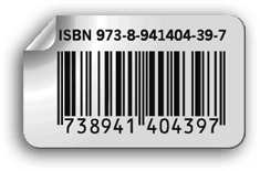
When purchasing the ISBN, you will be able to also buy a barcode for $25. If you don’t buy a barcode at the time of purchase at Bowker, Presto Page can create a barcode (for the same price), and we will incorporate the cost of the book into the barcode and also place it on the back cover for you.
We recommend that you purchase our barcode creation service because we charge the same price for placing the barcode on your book cover as creating the barcode itself. We will also incorporate the amount you want into the barcode. But always buy your book’s ISBN directly from Bowker if you’re going to own your book’s rights as the publisher.
How Much Should an ISBN Number Cost?
Bowker sells a single ISBN for $125. Bowker also sells a block of 10 numbers for $295.
Are Discounted and Free ISBN Numbers Legitimate?
Be wary of a book publishing or book printing company that offers discounted, bulk, or free ISBNs. Any company that does so has purchased ISBNs in volume. If they’re reselling or giving those ISBNs away, they — the company — will be listed as the publisher of your original work. ISBNs also cannot be transferred from owner to owner. If you want to self-publish your book, be listed as the publisher, and own the book’s rights, you should buy an ISBN from Bowker.
Do I Need an ISBN?
If you want to sell your book in a store, you need an ISBN. Note: each version of the book (i.e., hardback vs. paperback, ePub vs. PDF) requires its ISBN. Consequently, this is where buying a block of ten ISBNs from Bowker can sometimes make more sense than buying a single one. If, however, you are publishing a book for non-commercial purposes, you don’t need an ISBN. Examples of this are family cookbooks or a book you’ll be exclusively giving away.
Four Parts of an ISBN
The ISBN Consists of Four Parts:
- The group identifier (0-1 for English-speaking countries)
- The publisher code
- The item number (the title of the book)
- A checksum character (check digit)
Let us Create your Barcode
Barcode Creation
Presto Page can create a barcode with a price built right into it. We charge $25 for this service, and it includes placing the barcode on the back cover of the book as well.
When you buy your ISBN, do not buy the optional barcode. Most book barcodes that you buy will be in a .eps format that only can be used in high-end page layout programs like Adobe Creative Suite. If you try to place the .eps file into word processing programs like Microsoft Word, the barcode will become a low-resolution graphic that scanners will not read.
It costs the same price for Presto Page to create a barcode for Presto Page to place a customer-supplied barcode on the back cover of the book. Save yourself $25 when you purchase your ISBN by having Presto Page create and put the barcode on for you.
Please note, the self-publishing author must supply Presto Page with the ISBN. Presto Page does not sell ISBNs.
What Size Should My Barcode Be?
Barcodes can range in size, but the minimum width is 2″ by a height of 1″. When you layout the back cover artwork, keep a minimum of 2″ x 1″ white space for the barcode placement. We will place the ISBN barcode we create for you in the space provided in your artwork.
Have Questions about ISBN Numbers?
If you have any questions about our barcode creation services, please feel free to call our friendly staff at (616) 247-0060.
Or contact our Presto Page support team; they would be happy to answer any questions you may have.
Color Matching
Presto Page uses a CMYK digital printing process, which means our presses print a wide range of hues using cyan, magenta, yellow and black inks. We will reproduce color from submitted print-ready files as closely as possible, but an exact color match is not possible even under the best circumstances. As a result, Pantone color matching is not a Presto Page offering. However, if you specify a spot color in a document, we will simulate that color using CMYK ink to match the color as closely as possible. This is an inherent limitation in the printing process.
The term “color matching” refers to the color rendering intent specified in the submitted artwork. However, if you define a spot color in a document, we will simulate that color using CMYK ink. The match will be as close as our printing equipment can get, but it will never be as perfect as using a real spot color. This is the case with most digital presses.
Please note: Many bright or very dense colors cannot be matched very well at all. In these cases, we will print the next closest color our equipment can produce.
Pantone® Colors
Pantone colors are the most common type of spot color. Each color has a number, which is its name. For example, if you were to choose Pantone 286 C for an artwork element, this identifies an exact color (a lovely deep blue). You can get a Pantone color guide and see for yourself exactly what this color is supposed to appear. That is what makes named spot colors so valuable.
Spot Color Overview
Spot Colors were invented for the world of lithographic printing, where ink was specifically mixed to create specialty colors. If you print with a spot color on a litho press, you are putting a particular color of ink on the printing press to produce that exact color.
In some programs, such as Adobe or Quark products, it is possible to choose spot colors. A spot color is a named color that is treated individually in the printing process. Most colors in your document are specified as formulas and are defined by name- either as CMYK, RGB, or LAB. Spot Colors.
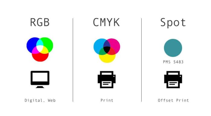
Spot colors are expensive, however. For this reason, most printing is done using a combination of Cyan, Magenta, Yellow, and Black ink on a four-color press. Those four colors, in combination, produce the vast array of colors you see on a printed page.
You would think that if you mixed those four colors just right, you could reproduce any spot color. This is true for most spot colors – but not all of them. For example, fluorescent colors are too bright to print with CMYK inks. Other spot colors have unique properties that cannot be reproduced with standard inks, such as metallic-looking colors.
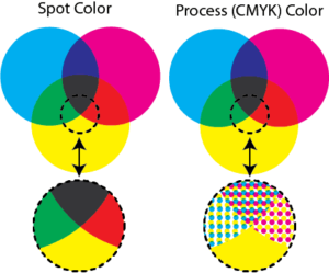
Spot Color Matching
Presto Page does not offer spot color printing except by special arrangement. Click HERE for an estimate. However, if you specify a spot color in a document, we will simulate that color using CMYK ink. The match will be as close as our printing equipment can get, but it will never be as perfect as using a real spot color. Also, many bright or very dense colors cannot be matched very well at all. In these cases, we will print the next closest color our equipment can produce.
If your job is highly color critical, we recommend ordering a hard proof. That way, you will know what kind of color you can expect from your artwork.
Cutting Tolerance:
What to Watch for When Setting up Your Book Cover
What should you watch for when setting up your cover? Many factors go into cutting books apart before being bound, such as misregistered sheets, jogging the paper, clamp pressure, and even the sharpness of the blade matters. If those printing terms are foreign to you, don’t worry; we lay things out below. With that said, we strive to be 100% accurate with our work, but there are times the cutting tolerance can be noticeable. It is standard in the printing business and nothing you need to be overly concerned with, but you should plan for such possibilities when working on the layout.
Cutting Tolerance
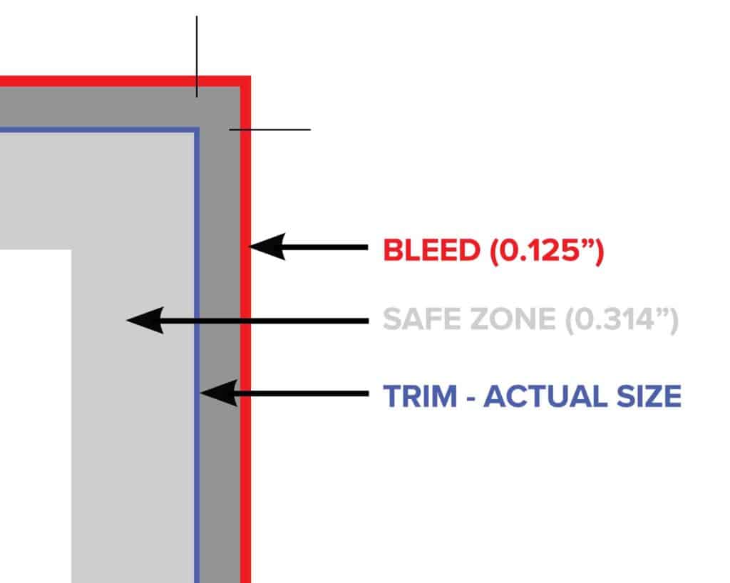
Here at Presto Page, we strive to produce 100% perfect products. However, as with any mechanical process, some tolerances should be taken into account. Our trimming tolerance is 1/16″ in either direction. For example, the cutting tolerance is the slight variations when printing projects are cut down to size. Also, anything that comes within 1/16″ of the edge of the cut line could potentially be cut off. For example, text or other elements that you want to ensure are not trimmed away must be placed more than .314″ away from the design’s expected edge – for binding purposes. Please see the bleeds and borders help page for more information on bleeds, borders, and margins.
Setting Up Your Cover:
Cutting Tolerance and Document Setup
The diagrams below are for helpful document setup and to learn more about cutting tolerance. Here, the 1/16th” cutting tolerance is the worst-case scenario, not an expectation. There will always be a bit of a draw on a cutter, and we want you to be informed of this possibility.
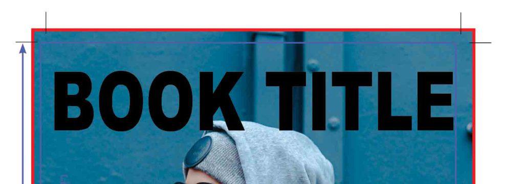
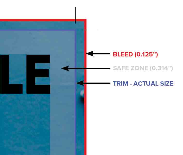
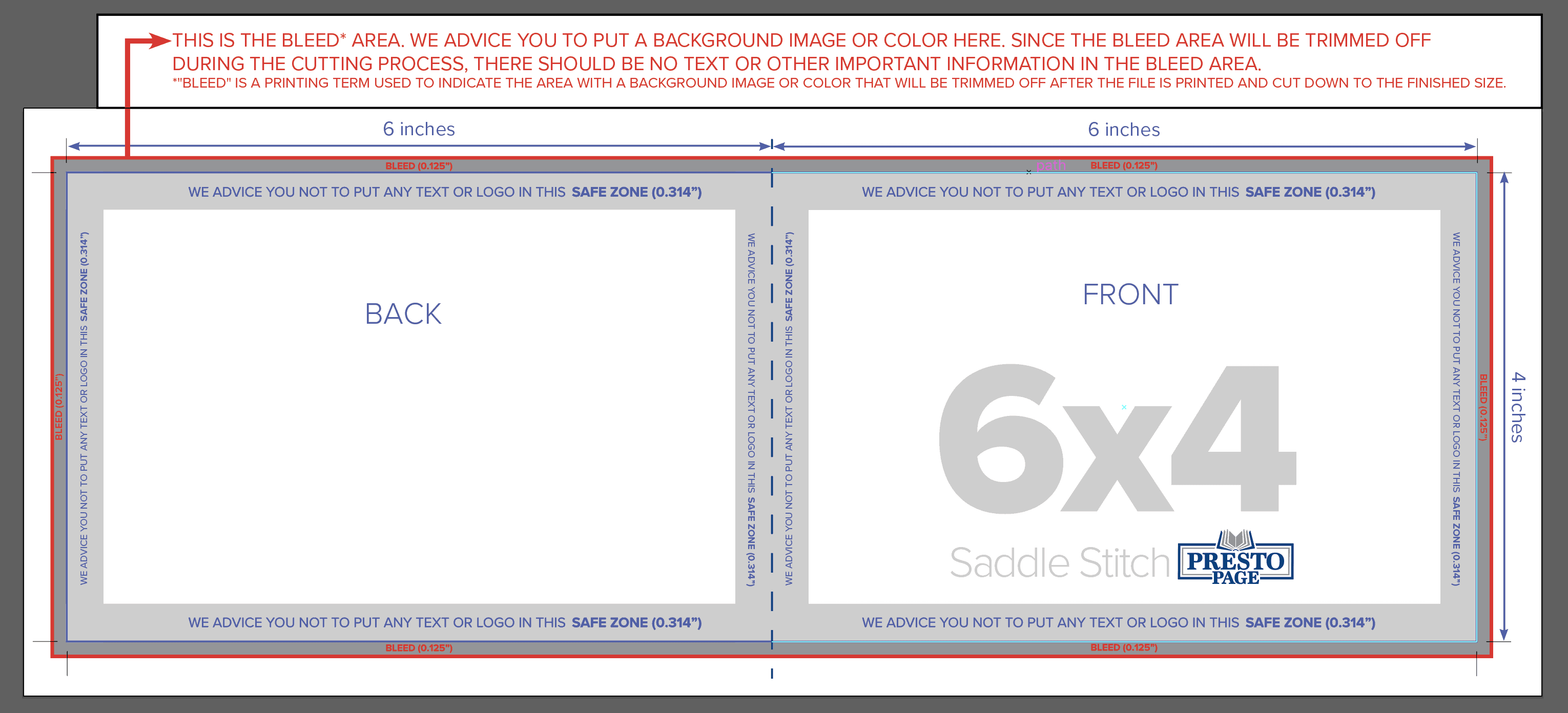
Please note, if your project has art going to the edge, a 1/8″ bleed is needed. Also, essential elements should not be in the “Safe Zone” (.314″) from the edge of the page to allow for the cutting and the bookbinding tolerances.
In this example, the trim marks indicate the intended document bounds. In comparison, the solid blue line represents the cutting tolerance and how the cutting can vary up to 1/16″.
To the right, the dotted boxes represent the punching needed for the twin loop. As you can see, the logo is bleeding into the “Safe Zone” and will be punched through. Consequently, Presto Page uses a Safe Zone of .314″ on all of our covers because it allows for all the possible binding options. As a rule, you must account for the binding style when you design your covers’ layout. If not, the result will look off-centered.
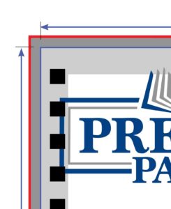
Image Resolution
Pixel Basics
Pixels are the building blocks of an image. Whether it is a graphic or a photograph, every digital image comprises thousands or even millions of individual pixels. The more pixels contained within an image result in greater detail and quality.
The number of pixels makes a huge difference in quality!


Image Resolution for Your Print Job
It is important to note that a low-resolution image cannot be made into a high-resolution image. There is no way to add pixels to improve an image’s quality, so when working with images, the higher the quality, the better – especially if you are in doubt.
The most important element to consider when printing your image, or images, is how large you can print an image while still maintaining quality and detail. PPI (pixels per inch) refers to the pixels contained in a digital image. DPI (dots per inch) refers to the number/density of ink dots printed by a press.
BOOK COVER FORMAT: For small format jobs such as brochures or booklets, it is recommended that images for print be saved at 300ppi, as this will help achieve a high-quality print. To calculate the desired file size, multiply the final printed size of the image in inches x 300. For example, if an image is 4” x 6″ on the printed page, 4×300 by 6×300 = 1200 x 1800 resolution.
Using Photoshop to See Image Size
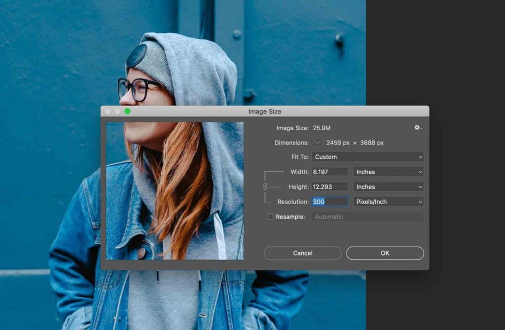
Graphic-editing software such as Photoshop will almost always measure an image’s resolution via pixel dimension. To see what your image dimension is, go to Image > Image Size.
This image can be printed up to about 8.197 X 12.293″ at 300 PPI.
Understanding Bleeds and Crop Marks
Borders on Artwork
Considering the bleeds and borders, first start designing with a minimum safety margin of .314″. If you add a border to your book cover artwork, then it is essential that your safety margin instead be .314″ to maintain border consistency on all sides. Border thickness is important because if it is too thin, the border may look uneven after cutting, but the thicker the border, the better the results. Cutting tolerance is 1/16th” or .0625″. Unfortunately, for smaller pieces, the shift in cutting tolerance will be more likely and more noticeable.
What is a Bleed?
A bleed is printing that goes beyond the edge of the sheet after trimming. It is part of the background that will be trimmed off after the file is printed and cut down to the finished size. As such, the bleed is an area where the document image is extended from one side of the paper to another without critical information in it. Although, if a bleed is not included in the document set up, there is a good chance that there will be a gap between the edge of the printed area and the cut line. This happens because there is tolerance when cutting the printed piece. Please take a look at our cutting tolerance help page for more information on how cutting tolerance may affect print work.
Bleed Size
It’s pretty easy to set up bleeds in the major design programs. Bleeds of 1/8” are required for all four types of Presto Page book covers.
Important Page Setup Information
Bleeds and Crop Marks
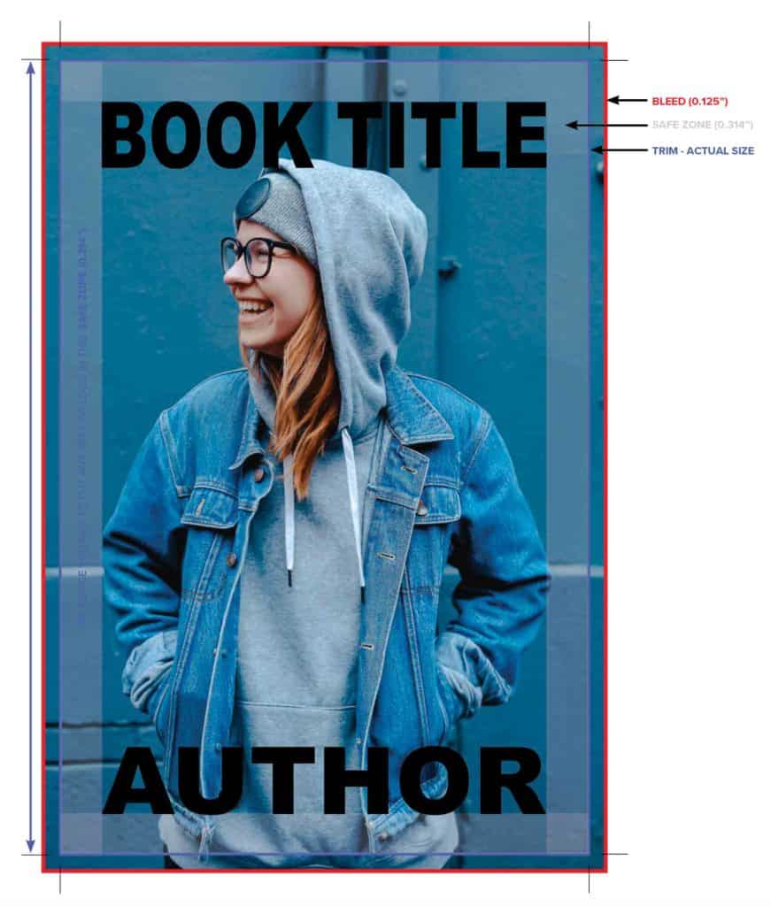
Crop Marks sometimes referred to as Trim Marks, need to be included on all four corners of the document. The bleed on this 8.5 x 11″ document is .125″. The document’s edge is shown with the blue outline (please do not include this in the actual file). There is a safety margin (safety zone) shown in transparent gray. It is .314″ from the edge of the document. Above all, there must be no information outside the safety margin.
Correct Document Setup
This is an example of a document that is set up correctly, and none of the important information will be trimmed off. The image goes to the edge of the bleed, and all the text is positioned comfortably and outside the safety margin.
Incorrect Document Setup
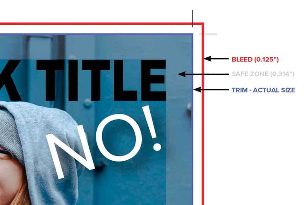
In contrast, this example is not set up correctly. The image does not go to the edge of the bleed, and therefore there might be a white or blank line on the edge of the printed piece. However, the title is in a good position outside of the safety zone. Important information must stay outside of the safety margin.
Incorrect Document Setup
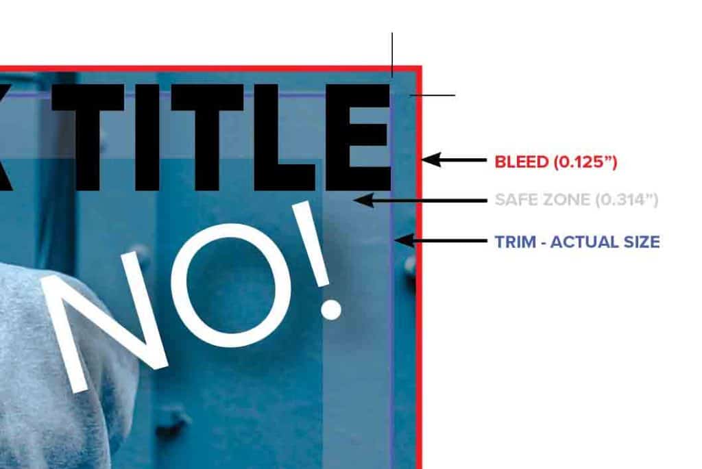
The image is set up correctly in this example because it is going to the edge of the bleed. However, the text is inside of the safety margin. Consequently, some of it will most likely be trimmed off.
Bleed Setup in Illustrator
Bleed Setup in InDesign
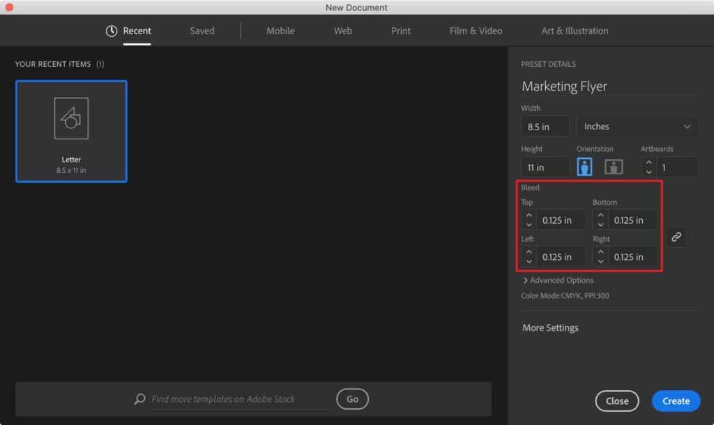
When creating a new document, you have to expand the Bleed and Slug section to get to the Bleed options.
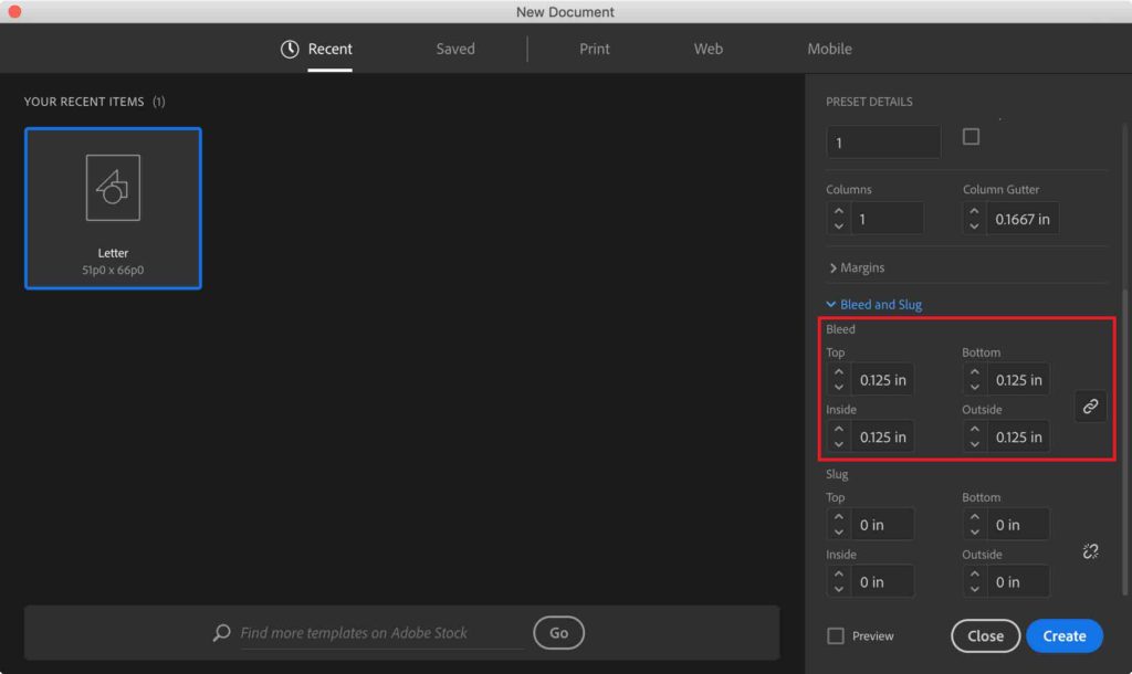
Optional: InDesign defaults to picas. If you type in “.125in” (the “in” for inches is very important), it will calculate that measurement in picas. If you would prefer to work in inches, another solution is to go to Preferences > General > Units & Increments. In the Ruler Units block, the Horizontal and Vertical should have the Inches option selected.
Bleed Setup in Photoshop
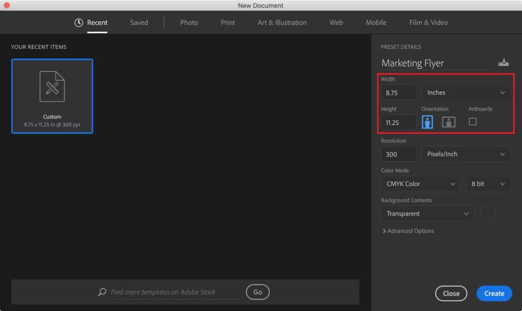
Setting up the correct document size takes a little bit of math. Unlike InDesign, there is not a default bleed setting. For example, let’s say you would like to create an 8.5 x 11″ document. There will need to be a bleed of 1/8″ on all four sides of the document. Therefore, the document size will need to be 8.75 X 11.25″ in size.
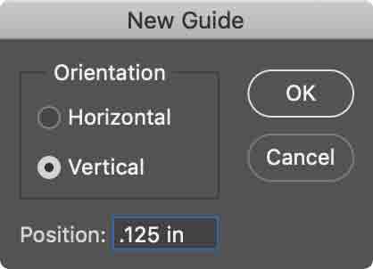
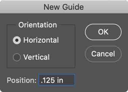
It is helpful to have guides for showing the actual product dimensions: go to View > New Guide.
Foil Stamping
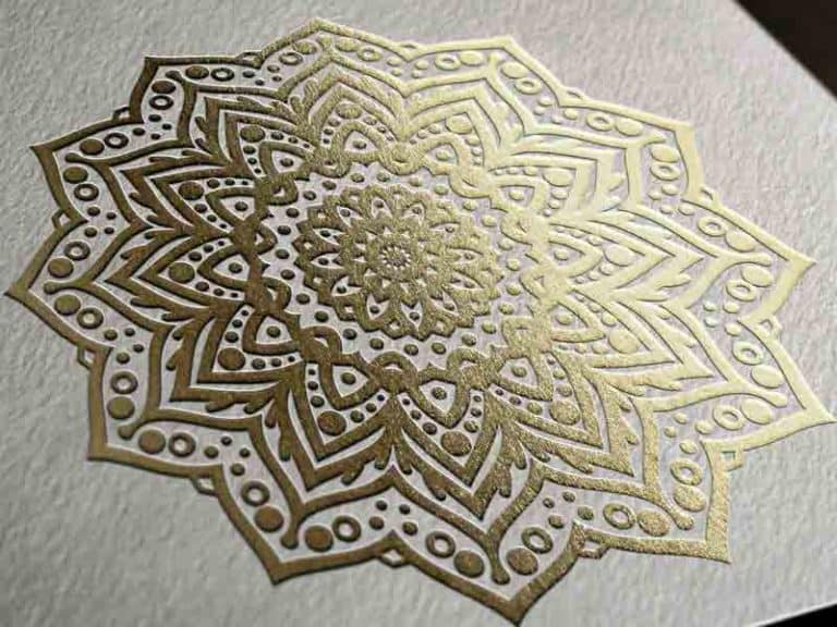
Foil stamping is an easy way to catch the eyes of consumers.
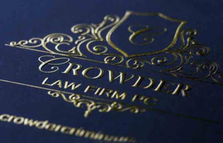
Nothing says “Best Seller” like Foil Stamping & Embossing.
Foil Stamping is the application of metallic foil to paper using a custom-made heated die. This process adds a shimmer and richness to crucial text or design elements on your book cover. Keep in mind: the photos on this page won’t do it justice. You have to see the finished product to fully appreciate the beauty that Foil Stamping, Embossing, and Foil Embossing provide.
What is foil stamping?
Foil stamping – also known as hot stamping – is done by applying pigment or metallic foil to paper using a hot die. The heated die applies the foil directly to the book cover. The foil stamping process types are metallic foils, gloss or matte pigment foils, special effects foils, and holographic foils.
Why foil stamping?
No matter which type of foil is used on your book cover, the three significant benefits of utilizing our custom foil stamping services are the same.
Benefits of Foil Stamping:
- Attention-grabbing effects. Foil stamping helps your book stand out from the crowd with its distinctive and eye-catching appearance.
- Professional presentation. Foil stamping conveys an image of professionalism and leadership. Increased sales. By enhancing its visual appeal, your book will be sure to fly off the shelves.
- Superior brand perception. Research completed by Perception Research Services, Inc. showed that consumers perceive a foil-stamped product to be of more value and higher quality than the same product without foil stamping.
You also have the option to foil stamp, emboss, or foil emboss your book cover – an excellent addition to any one of our book styles. It can give your book the polished and professional feel of a new release.
The material used for hot foil stamps is exceptionally delicate (think aluminum foil, but 100 times thinner). Because it’s so delicate, fonts or line-work below 1mm in thickness (2.83 points) are unsuitable for hot foil stamping and because
they may crack or flake off. Because of this, we recommend all areas be foil stamped to have a minimum thickness of 1mm.
Scratching and Scuffing
Due to its fragility, foil stamping can scratch and scuff easily. If you’re planning on covering large, unbroken areas with a foil stamp, be aware that scratches and scuffs can occur during shipping and general use.
Embossing & Debossing:
What is Embossing?
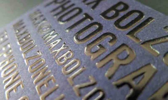
Embossing is the process of using a custom die under high pressure and heat to raise letters or designs above the surface of the paper, which produces an eye-catching 3D effect that allows you to feel the design.
Two examples of embossing that many of us have seen (and felt) are notarized documents or the raised lettering on the cover of a recent bestseller. Embossing can be used on its own – known as “Blind” Embossing – or in combination with Foil Stamping. Whichever you choose, an Embossed cover is a perfect way to give your book that added touch of class and professionalism that will set your work apart from the crowd. With Foil Stamping’s addition, the Embossing stands out both literally and figuratively, as shown in the images above.
It is a great way to draw out highlights and essential details, such as the title, author’s name, certain design elements, or a logo.
The same equipment that allows us to offer Foil Stamping also enables us to provide embossing services. Foil Stamping is frequently combined with Embossing to produce an attractive and eye-catching 3D image- called “Foil Embossing.” You’ll find that almost all the bestsellers today have Foil Embossed covers.
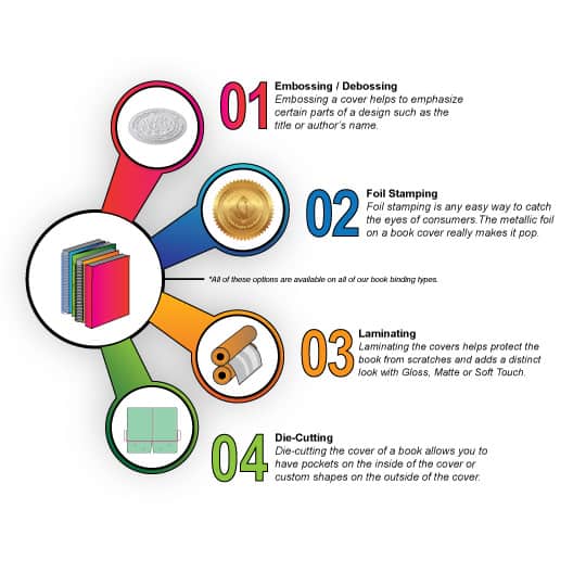
Embossing raises parts of the paper to emphasize design elements, title, or the authors’ name.
Debossing is the opposite; part of the sheet is indented to give a “sunken-in” look.
Foil Stamping and Embossing look great individually, but they look even better together. In this combined process, a heated die fuses the foil onto the paper, bonding the design to the surface. The same area is then embossed with a die to create a raised three-dimensional image.
A more complex
version could include
large, multi-level,
beveled, or sculptural
embossing.
Our Other Services
If you’d like more information about Foil Stamping, Blind Embossing, Foil Embossing, send us an email, we’d be happy to answer all of your questions. For pricing inquiries, use our Perfect Bound checkout, Saddle-Stitch booklet checkout, Plastic Coil book checkout, or our Twin Loop Wire-O book checkout. And place an order today!
How to Format your Text
For all of our DIY authors publishing through Presto Page, we want your final product to be better than the industry standard. Those of you who know that quality matters know that we offer the best professional quality for the price. And we will give you a final product you will be honored to present. But before we get to the printing, there’s the necessary step of formatting your manuscript.
First of all, why is formatting so important?
- 1. Any errors will have to be fixed before printing — not catching mistakes ahead of time adds preventable costs.
- 2. It offers credibility, sure your verbiage, creativity, and plot hold the utmost importance but the layout gives your final work a professional impression.
You’ve worked hard on your manuscript, and you want to give it the best chance to become a household name.
This guide offers you:
- 1. Formatting guidelines to ensure your manuscript looks and feels professional.
- 2. Simple instructions to formatting in Microsoft Word
Getting Started: What is a Manuscript?
A manuscript is your work of fiction or nonfiction that you submit to a publisher or agent in the hope that someone will turn it into a published book. Or if you are bypassing that entire exhaustive process and print your book through Presto Page. Above all, you will be fully in charge of your writing career.
What is Book Formatting?
Formatting is how your manuscript looks. This includes things like whether the lines are single- or double-spaced. What size font? Typeface? How are numbers rendered — as digits or written out?
Manuscript Formatting Guidelines
There are a few different formatting styles, such as The Chicago Manual of Style or the AP (Associated Press) Style. If you were submitting to a publisher who specifies, naturally you want to give them what they want. But since you are self-publishing, we suggest you stay consistent with industry standards. For instance, if you write out numbers between zero and nine and use digits for any after that, do it the same way every time.
As for how to layout your manuscript pages and determine their look, following certain general rules will make your manuscript look professional.
- Use 12-point type
- Use a serif font; the most common choice is Times Roman
- Double-space your manuscript
- No extra space between paragraphs
- Only one space between sentences
- Indent each paragraph half an inch (setting a tab, not using several spaces)
- The text should be flush left and ragged right, not justified
- If you choose to add a line between paragraphs to indicate a change of location or passage of time, center a typographical dingbat (like ***) on the line
- Black text on white background only
- One-inch margins (the default in Word)
- Create a header with the title followed by your last name and the page number. The header should appear on each page after the title page.
Implementing the Format
Furthermore, here’s more detail on each of these rules to help you understand how to format your manuscript in Microsoft Word.
Use 12-Point Type:
Twelve-point is the size of the text (letters an inch high would be 72-point type). Make sure your formatting is set to 12 by clicking this button in Word.
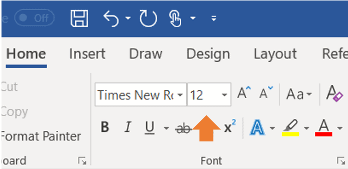
To format your document all at once, press and hold Ctrl and press A to select the whole document, then use the font change box to change all the text. You can apply this same procedure to any editorial change you wish to make in an entire file at a time.
Use a Serif Font:
Fonts are the various designs of typefaces. Serifs are those small projects that finish off a letter, as in Times Roman type. Choose Times New Roman, and you can’t go wrong. Here’s how to change your font, if necessary, using the same procedure we used to change the type size:
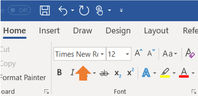
Double Space Your Manuscript:
This means your manuscript will have a space between lines, like this:
This is an example of double spacing, as opposed to the single spacing of the rest of this blog post. You do not want to accomplish this by hitting Enter at the end of each line. That will result in garbled formatting. Set your word processor to double space using this button:
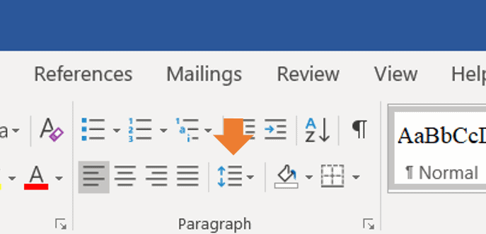
No Extra Space Between Paragraphs:
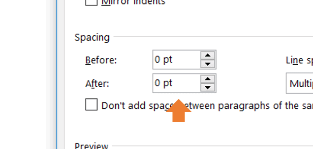
Notice the extra space between the paragraphs of this page? Manuscripts shouldn’t have those because published books customarily don’t. Unfortunately, Word is often defaulted to adding .8 points extra between paragraphs, so you’ll want to change that this way (and make it your default):
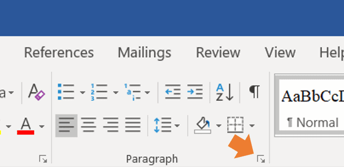
Only One Space Between Sentences:
Those of us who learned to type on typewriters were taught to hit the space bar twice between sentences, and it’s a hard habit to break. But you never see more than one space between sentences in published books.
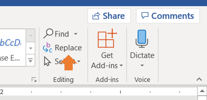
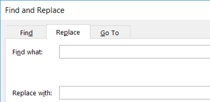
So if you’ve already written your manuscript with two spaces between sentences, don’t despair. There’s a shortcut to fixing this in Microsoft Word.
First, click Replace.
Indent Each Paragraph Half an Inch:
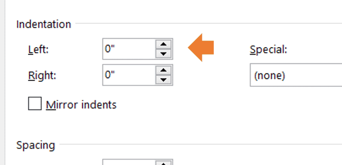
Choose this option in the menu shown here, not by hitting the space bar several times at the beginning of each paragraph. This way your new paragraphs are automatically indented when you hit Enter at the end of the previous one.

Text Should Ragged Right, not Justified:
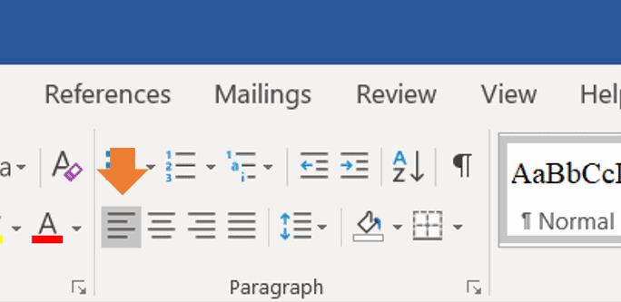
Ragged Right means your text doesn’t line up perfectly against the right side of the page the way it does on the left. In a published book, the text is often Justified, but that’s after editing and proofreading and final formatting. For your manuscript, any copy that you don’t want to be centered (like chapter titles) should be Flush Left and Ragged Right.
Your text should look like this:

Not like this:

Notice that the second paragraph adds space between the words to make the lines all the same length. Click here to make your text ragged right.
One Inch Margins:
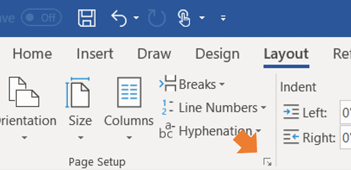
Your margins are the white space at the tops and bottoms and sides of the page where there is no text. They should be one inch by default.
If you need to adjust them in Microsoft Word, click on Layout, then Margins, and choose the first option, Normal.
Don’t Fret
Too many writers worry more about formatting that they do the writing of their nonfiction book or novel manuscript.
If all the above tips read like Greek to you, get a young person to walk you through them. And if all else fails, follow as many of the basics as you can. The crucial ones are the san serif typefaces and 12 pt. size, Ragged Right, double spaced lines, one space between sentences, and indented paragraphs.
Most important to a reader is whether you have something to say, can write it engagingly, and tell a story (fiction or nonfiction).
Make Sure Fonts are Embedded in PDF files
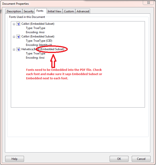
Your fonts must be embedded in your manuscript’s PDF files. Even common fonts must be embedded. To make sure your fonts are embedded in Microsoft Word:
- Select “File” in the upper left-hand corner
- Then select “Document Properties.”
- And then select “Fonts.”
- Then choose “Document Properties.”
- Once the window opens, select the “Fonts” tab.
Here, the window will show all the fonts being used. If a font is listed as an “embedded” or “embedded subset,” the font is good to go!
Match PDF Size to Trim Size
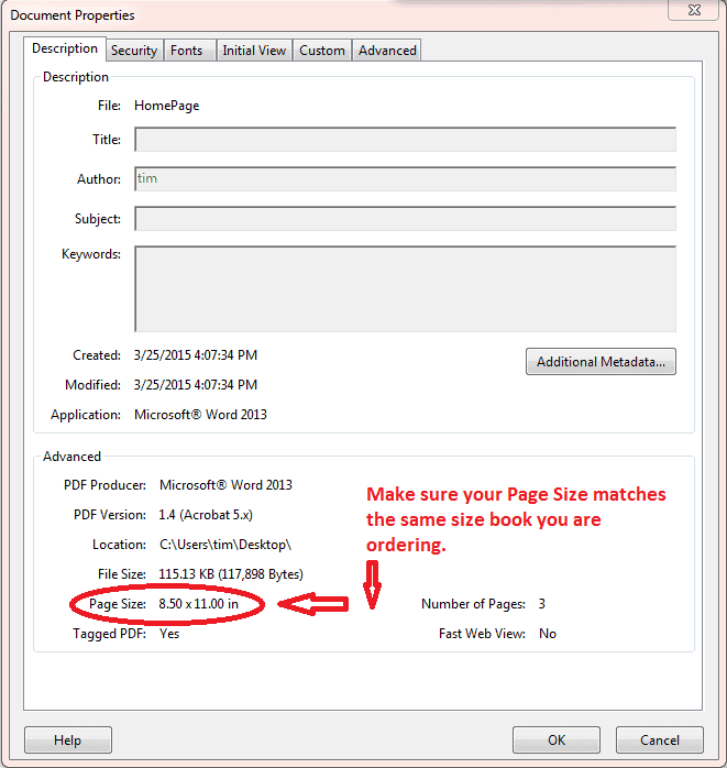
Your PDF files must match the size of the book you are ordering. If you want your book trim size to be 8.5″ x 11″, then the PDF file needs to be 8.5″ x 11″. To check your PDF page size:
- Select “File” in the upper left-hand corner
- Select “Document Properties”
- A screen will come up that displays your page size.
Use High-Resolution Graphics
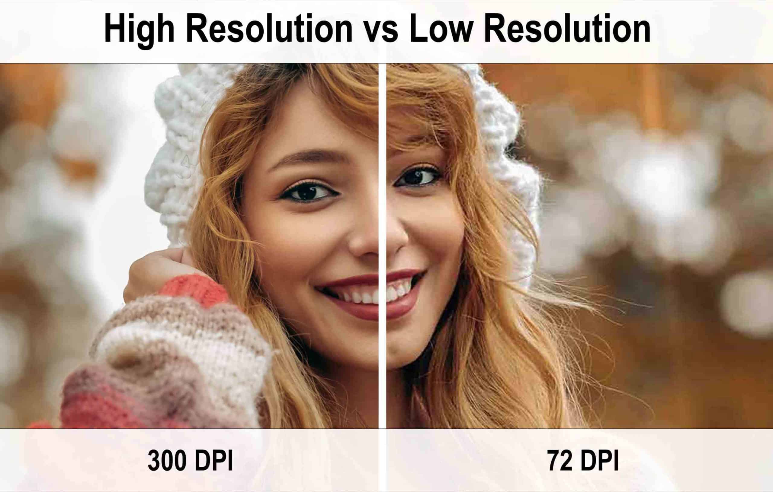
Make sure all the images and graphics included in your files are high resolution. The last thing you want to do is get your book printed using fuzzy graphics and photos. When scanning your images and graphics, make sure to use the highest quality setting or at least 300 DPI. See the difference below of a high-quality image versus a low DPI image.
Check out Image Resolution for more info.

How to Format Your Book Cover
Before you hire a designer or try tackling designing the cover yourself, have you tried our free cover design program right here on PrestoPage.com? If not, click here. Or if you’d rather be more hands-on in the creation of your masterpiece, please check the specifics below and download our Pre-Design Checklist:File Format Guidelines for the Book Cover
Are you ready to send your manuscript files to begin the printing process? Great! Here are some helpful reminders about file format requirements for your covers: Remember:- There should be one PDF file of the front of your book cover and another separate PDF file for the back of the book cover.
- Fonts must be embedded in both PDF files.
- Make sure any graphics are high resolution.
- Your PDF page size must match the trim size you’ve ordered.
Set Up Your Cover and Text Files Separately
When sending PDF files, make sure to include all the pages in the interior PDF file, even the blank pages. And keep the cover artwork separate from the text file; if you don’t keep the files separate, the book pages’ pagination could be thrown off._____________________________________________________________
The 5 Most Common Mistakes in Book Cover Design and How to Avoid Them
1. Too many elements on the cover
This is an all too common mistake, particularly with inexperienced designers. It’s common to feel the need to fit multiple elements of your plot on the cover to give it a more descriptive feel. It’s also common to see covers with all main characters depicted to give readers a better idea of what they look like.2. Not a genre fit
This is a big one. Different genres have developed distinct differences in how book covers are designed. If your book cover does not share these stylistic similarities, readers interested in that genre will pass because it doesn’t look like other books they have enjoyed.3. Wrong or poor font choices
Once again, it’s all about signaling to readers what your book offers. Your font should be similar to other covers in your genre. Take a look at the fantasy book cover example below. We’ve got a classic fantasy-style image, but the font? Not so much. It’s cheerfully handwritten with flourishes that would be much more at home on a chick-lit or teen romance novel. This font makes this cover feel a lot lighter. You almost wonder if it’s a goofy tale about a spunky goblin navigating a difficult world of classic fantasy tropes.
4. Poor image quality
This is an easy mistake to make if you are new to book cover design, and it’s important to be able to spot it if you work with an inexperienced designer. When you use an image on a cover, be careful if you find you need to enlarge it at any point. Small images will decrease in quality as they are stretched to fill space. Looking at the cover below on the left, you can tell that the text is fuzzy, and the detail of the image is blurred.5. Poor readability
Today, book covers are displayed by vendors in several sizes and formats. Almost always, readers will see your cover at a size much smaller than a physical book cover. This means that it’s vitally important that your cover be legible when it is shrunk down and put in a list of books.Use High-Resolution Graphics
Make sure all the images and graphics included in your files are high resolution. The last thing you want to do is get your book printed using fuzzy graphics and photos. When scanning your images and graphics, make sure to use the highest quality setting or at least 300 DPI. See the difference below of a high-quality image versus a low DPI image. Check out Image Resolution for more info.