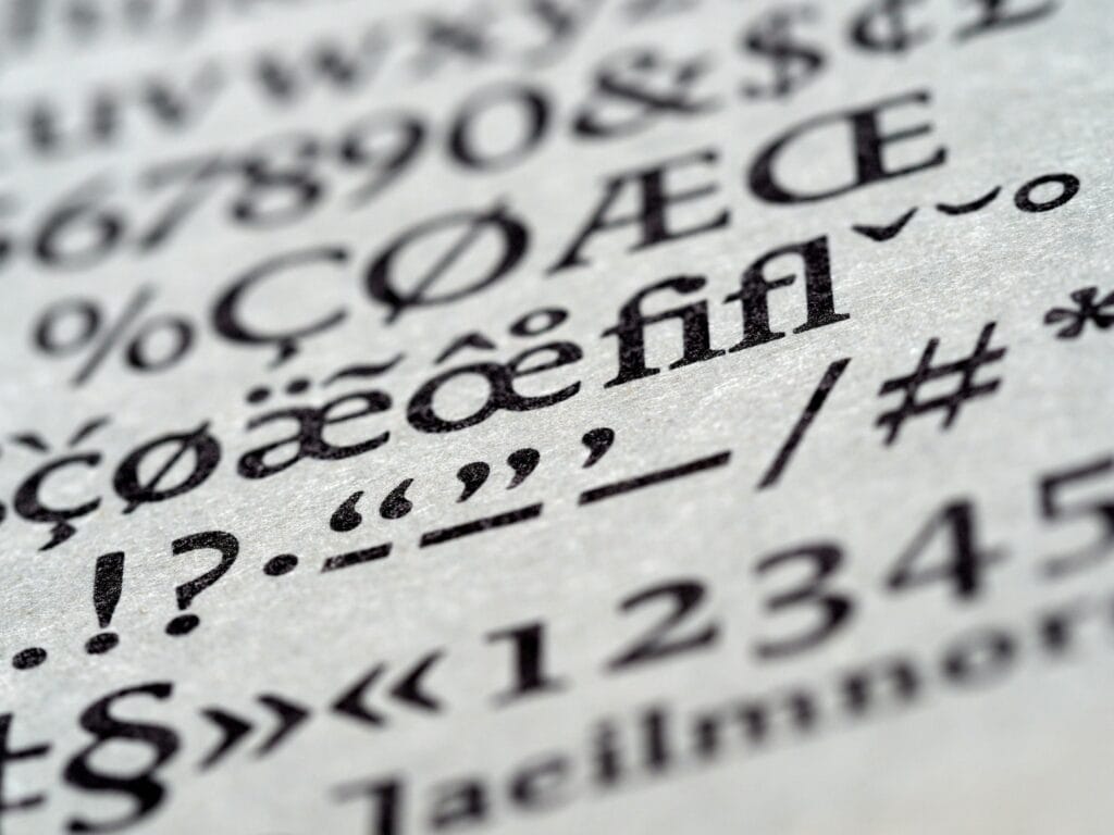
When designing your book, every detail matters, and few details matter more than choosing the right typeface. One oft-overlooked element that can significantly influence your book’s aesthetics and readability is typography. Fonts and typography play a crucial role in creating an enjoyable reading experience and conveying your book’s tone and message.
Choosing the Right Typeface
At first glance, a book’s fonts — especially interior fonts — may not make much of an impression. Beneath the surface, however, they carry a subtle but powerful message. Here are some ways fonts affect your readers:
- Setting the Mood: Fonts can evoke emotions and set the tone for your book. A playful, hand-lettered font may be perfect for a children’s picture book, while a classic serif font can convey timelessness in a historical novel.
- Readability: The primary job of fonts is to make your text readable. Clear and well-chosen fonts ensure your readers won’t struggle to follow the story. This is, sadly, not the best time for creativity.
- Branding: The font you choose can become a part of your author brand. Consider using the same font across all your books for consistency and easy recognition.
- Genre Matching: Different genres often have preferred font styles featured in their artwork. Science fiction may embrace futuristic fonts, while romance novels lean toward elegant script fonts. Horror novels, in turn, may feature bold, confrontational typefaces, or ghoulishly drippy fonts.
- Cultural and Historical Considerations: Be aware of the cultural or historical context of your story. A font that fits your book’s era can enhance its authenticity. Do a bit of research — many fonts are in fact hundreds of years old, so it’s a cinch to find something to match almost any time period. Just remember to exercise restraint, however, as no reasonable person wants to read a novel printed entirely in Gutenberg’s Blackletter.
- Balancing Visuals: If your book includes illustrations or graphics, the font should complement them, not compete with them. If you’re not sure, you may want to consult a professional designer for guidance.
Font Hierarchy
A well-designed book incorporates an effective font hierarchy, which helps guide readers easily through the content. It includes:
- Title Fonts: The title font should be bold, eye-catching, and convey the book’s genre and tone. It’s often the first impression your book makes. Feel free to be creative — the only limit is legibility.
- Chapter Headings: Chapter headings should be consistent and visually distinct. Almost like signposts, they help readers navigate the book.
- Body Text: Body text fonts should be easy to read and consistent throughout the book. Consider serif fonts for print and clean, readable sans-serif fonts for digital formats.
- Pull Quotes and Highlights: These elements should contrast with the body text, drawing the reader’s eye to important sections of your book. Choose a font that pairs well with your body text.
Font Size and Line Spacing
Aside from font choice, factors like font size and line spacing significantly affect your book’s legibility. Here’s what to consider:
- Font Size: Too small, and readers may strain their eyes. Too large, and it may appear unprofessional. Find the right balance.
- Line Spacing (Leading): Appropriate line spacing ensures that lines of text don’t appear cramped. It’s a vital element for readability.
- Justification: Decide whether you want your text justified (aligned on both sides) or left-aligned. Justified text, when done correctly, often appears more professional. Done sloppily, however, it can sometimes create awkward spacing (creating “rivers” of white space across your paragraphs). While left-aligned text is generally easier to read, some readers may find the ragged right edge unprofessional.
- Kerning and Tracking: These settings adjust the space between characters and words. Too much space and your text will look sloppy. Too little space and it will be difficult to read. Strike the right balance to make your text look more polished.
Proof Your Fonts
After choosing the right typeface, make sure you take it for a test drive in a real book format. Create a sample chapter to evaluate how your fonts work in the actual layout. Ensure that:
- The fonts look good in print and digital formats.
- They maintain readability in different lighting conditions.
- The text flows naturally, with no awkward spacing or line breaks.
Licensing and Rights
Lastly, be aware of font licensing and rights. Not all fonts are free to use for commercial projects. Make sure you have the proper licenses or permissions to use your chosen fonts in your book.
Get Creative, but Keep It Legible
While font and typography choices offer an exciting creative opportunity, readability should always be your top priority. The ideal font is one that enhances your book’s message and provides a smooth reading experience for your audience.
If you’re unsure about which fonts to choose or need assistance with the design and layout of your book, our team at Presto Page is here to help. We have the experience and expertise to ensure that your book’s typography complements your story and makes it a joy to read. Contact us today to find out how we can help.

