
We want your final product to be better than the industry standard for all of our DIY authors publishing through Presto Page. Those who know that quality matters know that we offer the best professional quality for the price. And we will give you a final product you will be honored to present. But before we get to the printing, there’s the necessary step of formatting your manuscript.
First of all, why is formatting so important?
- 1. Any errors will have to be fixed before printing — not catching mistakes adds preventable costs.
- 2. It offers credibility, sure your verbiage, creativity, and plot hold the utmost importance, but the layout gives your final work a professional impression.
You’ve worked hard on your manuscript, and you want to give it the best chance to become a household name.
This guide offers you:
- 1. Formatting guidelines to ensure your manuscript looks and feels professional.
- 2. Simple instructions to formatting in Microsoft Word
Getting Started: What is a Manuscript?
A manuscript is your work of fiction or nonfiction that you submit to a publisher or agent, hoping someone will turn it into a published book. Or if you are bypassing that entire exhaustive process and print your book through Presto Page. Above all, you will be fully in charge of your writing career.
What is Book Formatting?
Formatting is how your manuscript looks. This includes things like whether the lines are single- or double-spaced. What size font? Typeface? How are numbers rendered — as digits or written out?
Manuscript Formatting Guidelines
There are a few different formatting styles, such as The Chicago Manual of Style or the AP (Associated Press) Style. If you were submitting to a publisher who specifies, naturally, you want to give them what they want. But since you are self-publishing, we suggest you stay consistent with industry standards. For instance, if you write out numbers between zero and nine and use digits for any after that, do it the same way every time.
As for how to layout your manuscript pages and determine their look, following certain general rules will make your manuscript look professional.
- Use 12-point type
- Use a serif font; the most common choice is Times Roman
- Double-space your manuscript
- No extra space between paragraphs
- Only one space between sentences
- Indent each paragraph half an inch (setting a tab, not using several spaces)
- The text should be flush left and ragged right, not justified
- If you choose to add a line between paragraphs to indicate a change of location or passage of time, center a typographical dingbat (like ***) on the line
- Black text on white background only
- One-inch margins (the default in Word)
- Create a header with the title followed by your last name and the page number. The header should appear on each page after the title page.
Implementing the Format
Furthermore, here’s more detail on each of these rules to help you understand how to format your manuscript in Microsoft Word.
Use 12-Point Type:
Twelve-point is the size of the text (letters an inch high would be 72-point type). Make sure your formatting is set to 12 by clicking this button in Word.
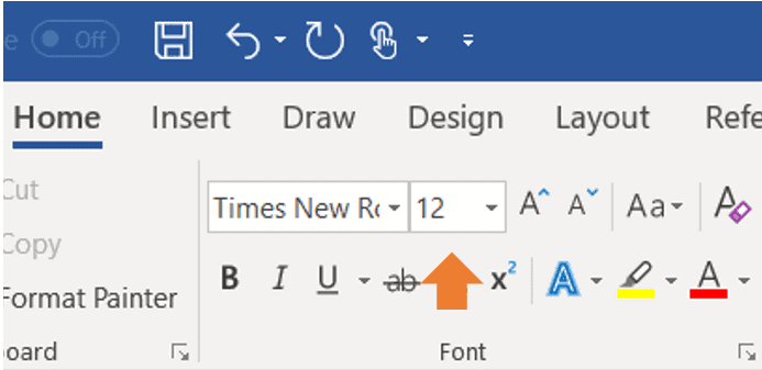
To format your document all at once, press and hold Ctrl and press A to select the whole document, then use the font change box to change all the text. You can apply this same procedure to any editorial change you wish to make in an entire file at a time.
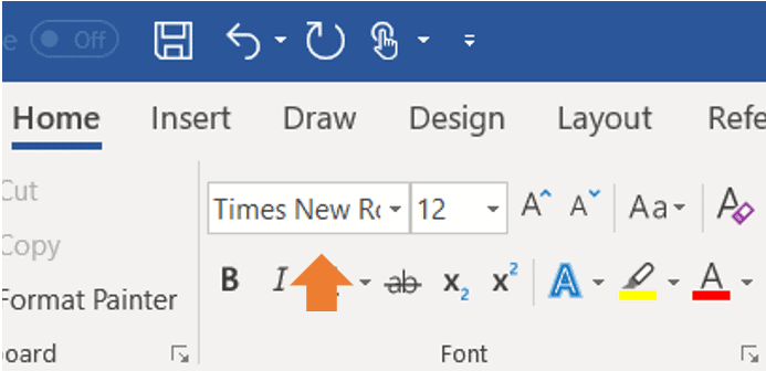
Use a Serif Font:
Fonts are the various designs of typefaces. Serifs are those small projects that finish off a letter, as in Times Roman type. Choose Times New Roman, and you can’t go wrong. Here’s how to change your font, if necessary, using the same procedure we used to change the type size:
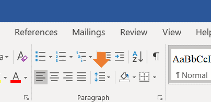
Double Space Your Manuscript:
This is an example of double spacing instead of the single spacing of the rest of this post.
This means your manuscript will have a space between lines, like this: you do not want to accomplish this by hitting Enter at the end of each line. That will result in garbled formatting. Set your word processor to double space using this button:
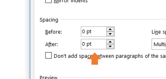
No Extra Space Between Paragraphs:
Notice the extra space between the paragraphs of this page? Manuscripts shouldn’t have those because published books customarily don’t. Unfortunately, Word is often defaulted to adding .8 points extra between paragraphs, so you’ll want to change that this way (and make it your default):

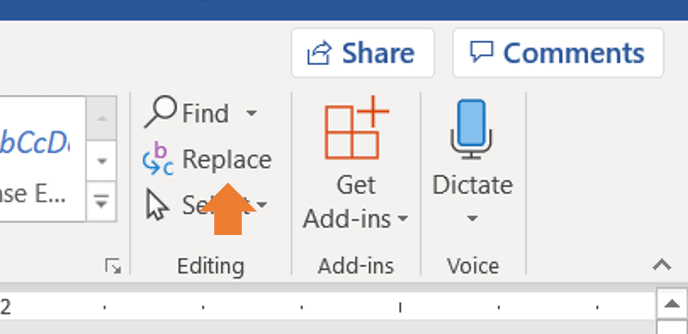
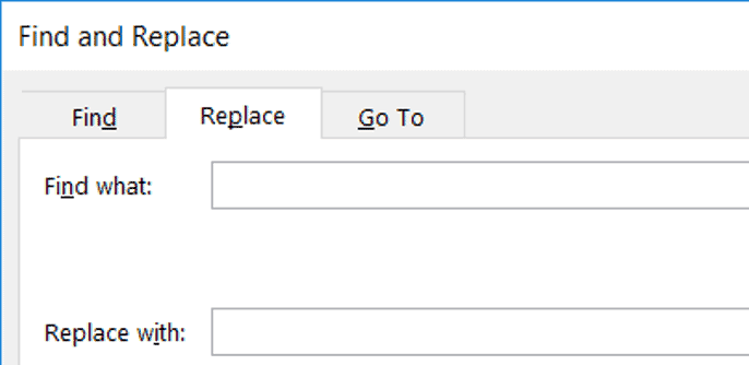
Only One Space Between Sentences:
Those of us who learned to type on typewriters were taught to hit the space bar twice between sentences, and it’s a hard habit to break. But you never see more than one space between sentences in published books.
So if you’ve already written your manuscript with two spaces between sentences, don’t despair. There’s a shortcut to fixing this in Microsoft Word.
First, click Replace.
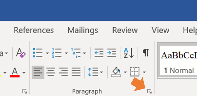
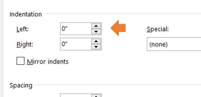
Indent Each Paragraph Half an Inch:
Choose this option in the menu shown here, not by hitting the space bar several times at the beginning of each paragraph. This way, your new paragraphs are automatically indented when you hit Enter at the end of the previous one.
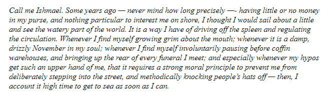
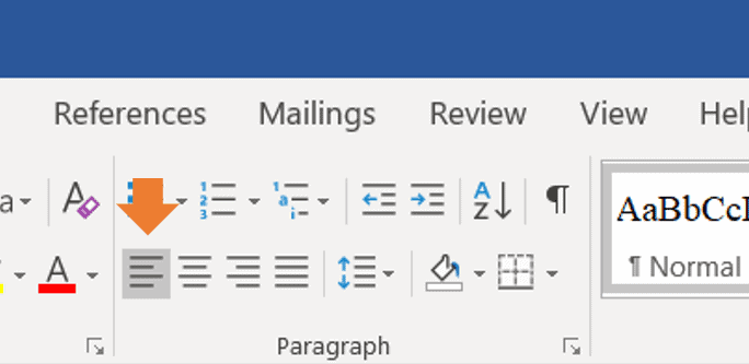
Text Should Ragged Right, not Justified:
Any copy you don’t want to be centered (like chapter titles) should be Flush Left and Ragged Right. Ragged Right means your text doesn’t line up perfectly against the right side of the page the way it does on the left. The text is often Justified in a published book, but that’s after editing, proofreading, and final formatting.
Your text should look like this:
Not like this:
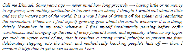
Notice that the second paragraph adds space between the words to make the lines the same length. Click here to make your text ragged right.
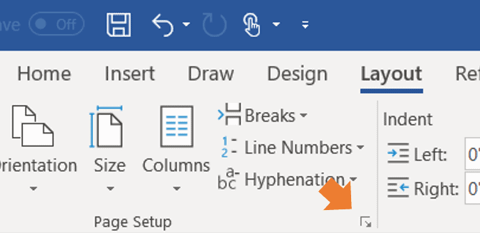
One Inch Margins:
Your margins are the white space at the tops, bottoms, and sides of the page without text. They should be one inch by default.
If you need to adjust them in Microsoft Word, click on Layout, Margins, and choose the first option, Normal.
Don’t Fret
Too many writers worry more about formatting than they do the writing of their manuscripts.
If all the above tips read like Greek to you, get a young person to walk you through them. And if all else fails, follow as many of the basics as you can. The crucial ones are the san serif typeface and 12 pt. size, Ragged Right, double spaced lines, one space between sentences, and indented paragraphs.
Most important to a reader is whether you have something to say, write it engagingly, and tell a story (fiction or nonfiction).
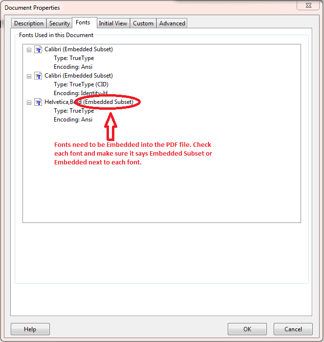
Make Sure Fonts are Embedded in PDF files.
Your fonts must be embedded in your manuscript’s PDF files. Even common fonts must be embedded. To make sure your fonts are embedded in Microsoft Word:
- Select “File” in the upper left-hand corner
- Then select “Document Properties.”
- And then select “Fonts.”
- Then choose “Document Properties.”
- Once the window opens, select the “Fonts” tab
Here, the window will show all the fonts being used. If a font is listed as an “embedded” or “embedded subset,” the font is good to go!
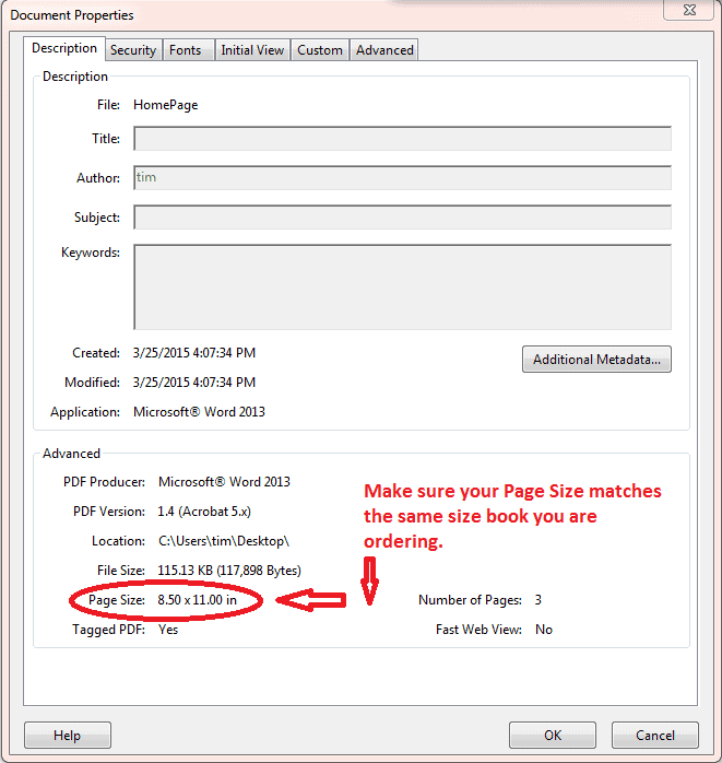
Match PDF Size to Trim Size
Your PDF files must match the size of the book you are ordering. If you want your book trim size to be 8.5″ x 11″, then the PDF file needs to be 8.5″ x 11″. To check your PDF page size:
- Select “File” in the upper left-hand corner
- Select “Document Properties”
- A screen will come up that displays your page size.
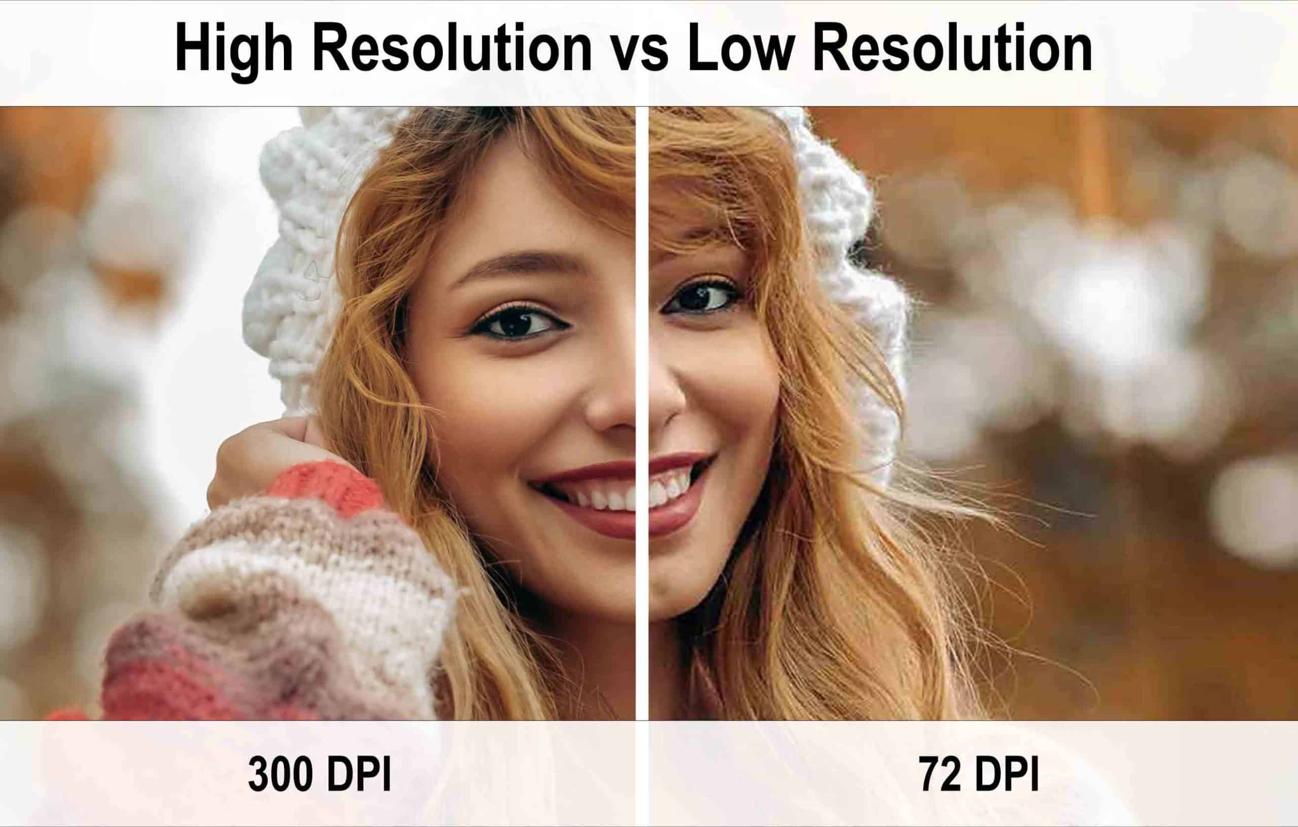
Use High-Resolution Graphics
Ensure all the images and graphics included in your files are high resolution. The last thing you want to do is get your book printed using fuzzy graphics and photos. When scanning your images and graphics, make sure to use the highest quality setting or at least 300 DPI. See the difference below of a high-quality image versus a low DPI image.
Check out Image Resolution for more info.
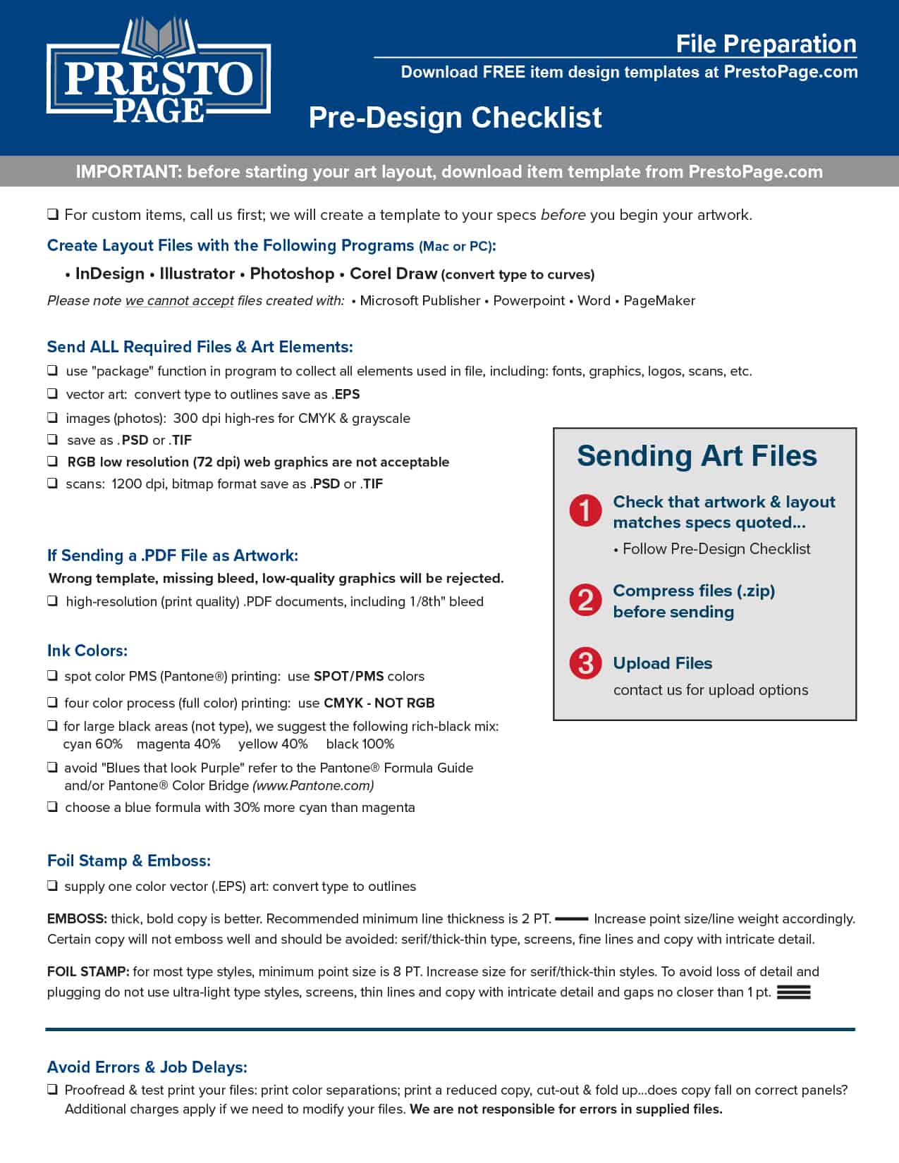
Before you hire a designer or try tackling designing the cover yourself, have you tried our free cover design program right here on PrestoPage.com? If not, click here. Or if you’d rather be more hands-on in the creation of your masterpiece, please check the specifics below and download our Pre-Design Checklist:
File Format Guidelines for the Book Cover
Are you ready to send your manuscript files to begin the printing process? Great! Here are some helpful reminders about file format requirements for your covers:
Remember:
- There should be one PDF file of the front of your book cover and another separate PDF file for the back of the book cover
- Fonts must be embedded in both PDF files.
- Make sure any graphics are high resolution.
- Your PDF page size must match the trim size you’ve ordered.
Set Up Your Cover and Text Files Separately
When sending PDF files, including all the interior PDF files, even the blank pages. And keep the cover artwork separate from the text file; if you don’t keep the files separate, the pagination of the book pages could be thrown off.
_____________________________________________________________
The 5 Most Common Mistakes in
Book Cover Design and How to Avoid Them
1. Too many elements on the cover
It’s common to feel the need to fit multiple plot elements on the cover to give it a more descriptive feel. It’s also common to see covers with all main characters depicted to give readers a better idea of what they look like. This is an all too common mistake, particularly with inexperienced designers.
2. Not a genre fit
This is a big one. Different genres have developed distinct differences in how book covers are designed. If your book cover does not share these stylistic similarities, readers interested in that genre will pass because it doesn’t look like other books they have enjoyed.
3. Wrong or poor font choices
Once again, it’s all about signaling to readers what your book offers. Your font should be similar to other covers in your genre. Take a look at the fantasy book cover example below.

We’ve got a classic fantasy style image, but the font? Not so much. It’s cheerfully handwritten with flourishes that would be much more at home on a chick-lit or teen romance novel. This font makes this cover feel a lot lighter. You almost wonder if it’s a goofy tale about a spunky goblin navigating a difficult world of classic fantasy tropes.
4. Poor image quality
This is an easy mistake to make if you are new to book cover design, and it’s important to be able to spot it in case you work with an inexperienced designer.
When you use an image on a cover, be careful if you find you need to enlarge it at any point. Small images will decrease in quality as they are stretched to fill space. Looking at the cover below on the left, you can tell that the text is fuzzy, and the image’s details are blurred.
5. Poor readability
Today, book covers are displayed by vendors in several sizes and formats. Readers will always see your cover at a size much smaller than a physical book cover.
This means it’s vitally important that your cover be legible when it is shrunk down and put in a list of books.
Use High-Resolution Graphics
Ensure all the images and graphics included in your files are high resolution. The last thing you want to do is get your book printed using fuzzy graphics and photos. When scanning your images and graphics, make sure to use the highest quality setting or at least 300 DPI. See the difference below of a high-quality image versus a low DPI image.
Check out Image Resolution for more info.